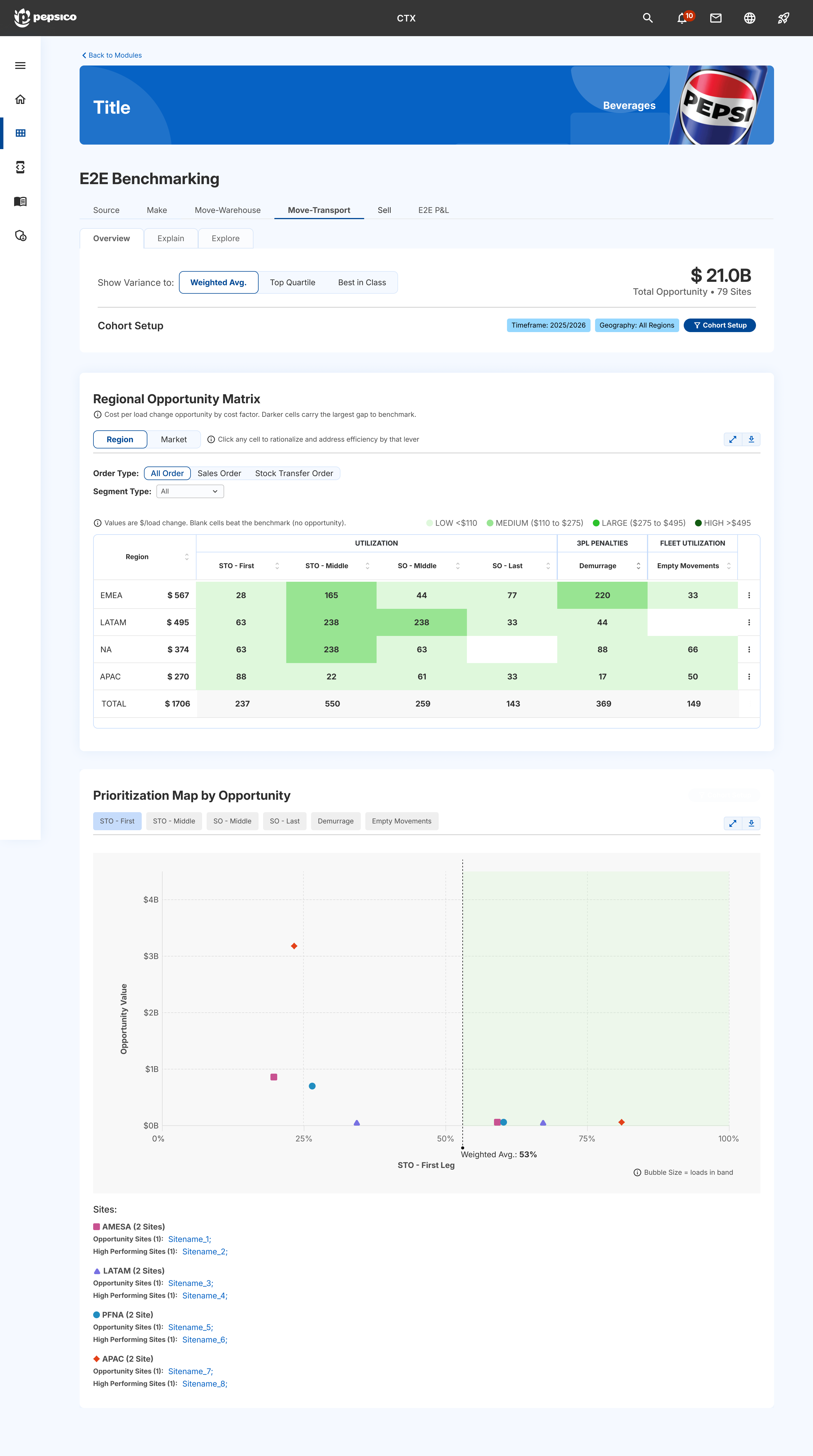
Problem
The agency direction was not landing with users or stakeholders.
The screen felt dense, heavily branded, and disconnected from the cleaner CTX suite direction.
My move
I redesigned the page around Scoping Pro's cleaner CTX language.
I partnered with the consulting designer while using the existing Scenario Modeling product as the visual reference point.
Tradeoff
Improved hierarchy and suite alignment without reopening the full product model.
The work focused on visual direction, navigation clarity, and density reduction inside a two-week window.
Outcome
Improved visual direction and a stronger pattern for future pages.
Cost Compass moved closer to a product-led CTX experience instead of feeling like a separate agency concept.